Components of Px Framework:
PxSuperGrid - component for the direct display of data in the table
PxSuperGrid component serves for the direct display of data in the table by means of the PxWebQuery components.
Using the PxSuperGrid components it can operate data as follows: You can insert new rows, edit or delete already
existing rows. Further, the component enables automatic sorting and paging.
The following example shows how to use the PxSuperGrid. First, load data from the to the PxWebQuery component,
which is opened by the "Open()" command and then bind this component, connect it to the PxSuperGrid component.
    protected void Page_Load(object sender, EventArgs e)

    {

        if ((!IsPostBack)&&(wquAdresar.Active==false))

        {

            wquAdresar.ConnectString = "User Id=adr;Password=aa;Data Source=xe;";

            wquAdresar.SQLSelect = "select idadresar , name, address, create_date from Adresar";


            wquAdresar.Open();

        }

        grdAdresar.PxDataSource = wquAdresar;

        grdAdresar.DataBind();

     }
adresar.aspx file:
   <Prx:PxWebQuery ID="wquAdresar" runat="server" Value="wquAdresar"/>


   <Prx:PxSuperGrid ID="grdAdresar" runat="server"

          PageSize="4"

          PxVisibleButtons="SIDEO">

   </Prx:PxSuperGrid>
To change the caption in the PxSuperGrid(Title) table, write the following
code in the *. aspx.cs file, assigned to the PxWebQuery component, property Caption.
wquAdresar.Columns["NAME"].Caption = "Name";
To change the display of buttons in the PxSuperGrid (make them visible or hide them),
use the PxVisibleButtons property of the PxSuperGridu component.
grdAdresar.PxVisibleButtons="SIDEO";
The further example describes the legend according to which the individual buttons
are displayed. If there is any letter there, the relevant button is displayed in the PxSuperGrid.
     S - select, row selection

     I - insert or enter a new row

     E - editing an existing row

     D - deleting an existing row

     O - open information form
Description of the PxSuperGrid buttons:
 | - this button is used to edit an existing row (E)
|
 | - this button is used to delete an existing row (D)
|
 | - this button is used for selection, row selection (S)
|
 | - this button is used to open the information form, it is mainly used to view details of the row (O)
|
 - this button is used to add a new row (I) - this button is used to add a new row (I)
|
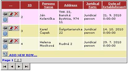
Image of PxSuperGrid components:

Image PxSuperGrid components, in state editing:

Image PxSuperGrid components in the state of editing, when the PxWebQuery component is applied method AddParamKey:

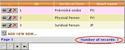
The PxSuperGrid component supports the view of the number of lines in the lower
right corner. This display can be activated through the VisibleRecordCount property
when it is set to "true". Text can be changed through the property CaptionRecordCount.
           grdAdresar.VisibleRecordCount = true;

           grdAdresar.CaptionRecordCount = "Number of Records:";
The display of the number of rows in the PxSuperGrid component you can see in the picture below:

If we want to enter the title of the PxSuperGrid component column (ToolTip),
we can do this through the property
Header.ToolTip. If we want to change the column name,
we can do this through the property
Header.Text. If we want to disable sorting for that column,
we can use the
Header.NoSort property and set it to "true". Similarly, through the
Header.ReadOnly property,
we can disable editing the column in the PxSuperGrid component. Assignment of these properties must be done
before the PxWebQuery component is assigned to the PxDataSource property.
            grdAdresar.Header["name"].ToolTip = "Zadajte právnu formu !!!";

            grdAdresar.Header["name"].NoSort = true;

            grdAdresar.Header["name"].Text = "Právna Forma";

            grdAdresar.Header["ID"].ReadOnly = true;
This picture shows an example of the assignment of the above mentioned properties.

The PxSuperGrid component contains the
DateFormat property, by which we can control
the date display in columns of the DateTime type in the PxSuperGrid component.
If we want to show also the time next to the date in the grid, we use
the mask "d.M.yyyy H:mm:ss", which we enter into the DataFormat property.
grdTyp_Uloziska.DateFormat = "d.M.yyyy H:mm:ss";
If we want to display only date, we use the mask "dd.MM.yyyy". If we want to
edit the date in the grid, we better use the mask "dd.MM.yyyy", because the automatic
validation would stop data storing if we did not enter the correct date also with zeros.
The example of data entering is shown below.
An example of the mask and then the input value in order to save the value
correctly and avoid stopping the storing process through automatic validation.
            "d.M.yyyy H:mm:ss"     -> 1.1.2011 0:00:00

            "dd.MM.yyyy H:mm:ss" -> 01.01.2011 0:00:00

            "dd.MM.yyyy"                 -> 1.1.2011
The PxSuperGrid component (as well as PxEdit, PxComboBox, PxFlyComboBox, PxJSDatePicker, etc.)
contains and supports automatic and complementary validation.
If the table column linked to the PxSuperGrid component is of the
string type,
validation of the string length is automatically carried out, if it is of the
int type,
validation operation to check whether the integer has been entered is carried out,
in case of the
date type, validation operation to check whether the valid date
has been entered is carried out, etc. For more information about the automatic
validation, see the Part II of this reference manual.
The picture below shows an example where we have entered a string which length
exceeded the length of string defined in the database. Then we have entered an invalid date.

When move the cursor on the mouse over the icon with an exclamation mark, a
tooltip displays an error message of the error that stopped deposition.
In this case a correct date has not been entered.
Here is a functional example of the PxSuperGrid component, even with source code.
This functional example on this site runs on MySQL 5.0 database.
Others articles of Px Framework:
- PxWebQuery - component for working with databases
- PxSuperGrid - component for the direct display of data in the table
- PxEdit - component for data editing, similar to the TextBox component
- PxComboBox - component for selecting data from a list, similar to the DropDownList component
- PxCheckBox - component for checking the value (Check / UnCheck value)
- PxFlyComboBox - set of the consecutively linked comboboxes, suitable for the work with structured data (for example: selection of category and subcategory)
- PxGreatRepeater - component for entering data with repeating structure, maximum number of values is limited
- PxJSDatePicker - component for the date entry, based on the JavaScript
- PxDbNavigator - the component for the work with the PxWebQuery components, row cursor movement, etc.
- PxLabel - component for data display
- PxCheckBoxList - component to view and select values from the list
- PxRadioButtonList - component for view and selection of a value from the list
- PxChart - the component for displaying and working with charts
- PxFilterView - visual component for filtering the table data contents in the PxWebQuery component
- PxUploader - component for uploading binary and text files to the server
- PxLogin - component for authorization and logging into the application
- Data loading from the Oracle, MSSQL, MySQL, FireBird, Interbase database by means of the PxWebQuery components
- Program inserting, editing or deleting of row into the database by means of the PxWebQuery component
- Loading values from the PxWebQuery component via the while cycle
- Row search in the PxWebQuery component according to the value entered and the name of the column where the search shall be carried out
- The "ReOpen" procedure of the PxWebQuery component and data re-load into the PxWebQuery component
- Validation, checking of the entered values by means of the PxWebQuery component and other visual components (PxEdit, PxComboBox, etc.)
- Events of the PxWebQuery component
- A special function GetValueFromStructKey of the PxWebQuery component
- Setting the language mutation of the Px Framework
- Finding the current version of the Px Framework
It doesn't the intention of this part website, describe in detail the work with PxFramework components, a detailed description of the component
available in manual, which can be downloaded here:
Download manual of Px Framework

